Brief
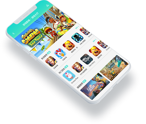
Tencent BONBON is a professional game platform under Tencent. It mainly provides the popular web games from Tencent, with the latest service news of the games, web game rankings and other functions. Also, it has prepared a wealth of game privileges for players. Plus, It is a bridge between Tencent News (OMG) and Tencent Games (IEG) to propagandize games on Tencent News based on the huge mobile data, not only is related to entertainment, but it will show the seriousness and immediacy according to the news.
Objectives
-
Design the game platform to recommend the new and popular games from Tencent according to the news and trends.
-
Provide an easy and clear user flow, let users get the important information fully and efficiently.
-
Create the clean, simple and useable interfaces and innovative new logo for the product.
-
Make UI element reusable and expandable and deliver to front-end developers by the clear annotation and guideline.
-
Mobile UI Design, Graphic Design, Brand Development.
-
Create motion graphics to improve the interestingness.
-
Brainstorm numerous ideas to achieve project objectives and transit from ideation to usability.
-
Produce high-quality visual design – from wireframes to delivery.
-
Work with product designers and UX designers to provide the design proposal.
-
Participate in the management of brands and develop specifications for the visual brand.
Wireframes & User Flow
some other ideas that we didn't go further, the first digital version brainstorm result.
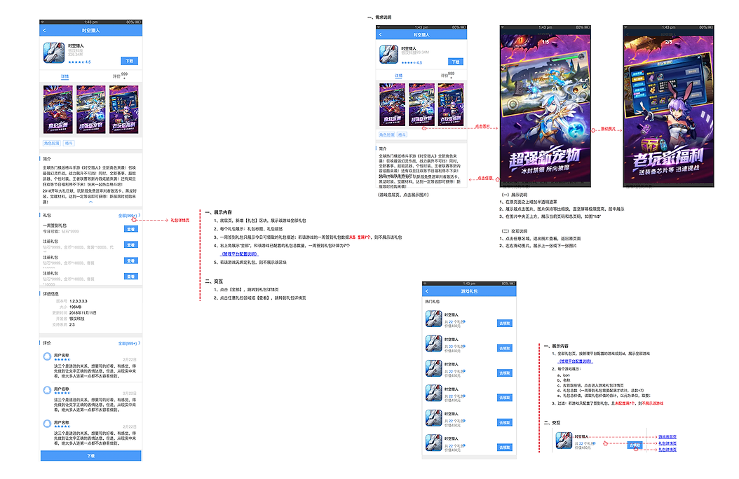
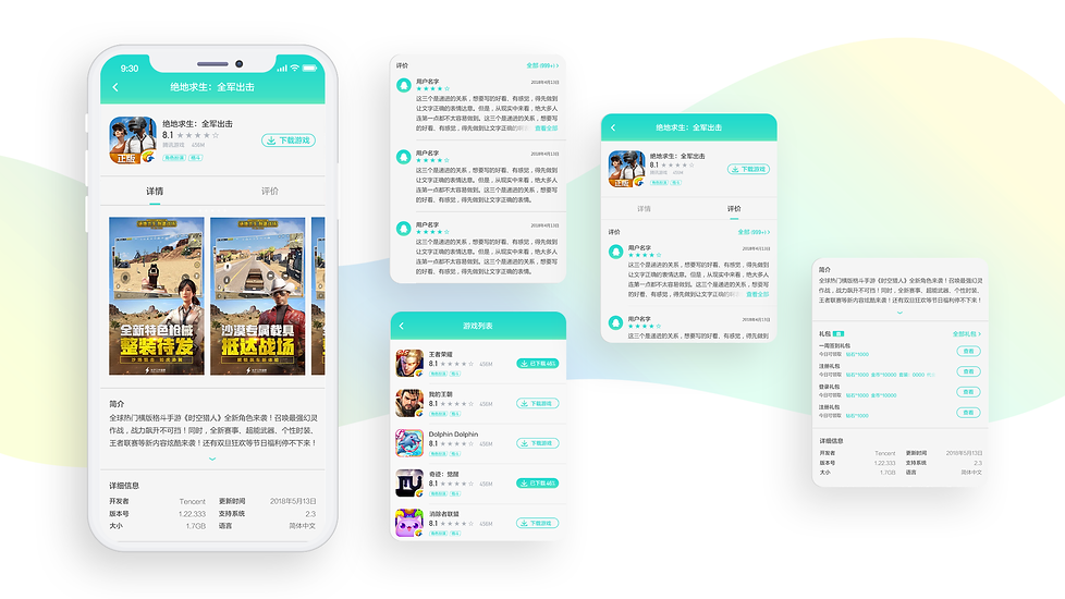
In the beginning, when product designers delivered the demands to me, I started to design wireframes with user flow. They are the deliverables visualizing the complete path that users follow across the whole solution. During a few iterations, finally figure the wireframes out, that achieve project objectives (Firstly, it is an easy and clear user flow, let users get the important information fully and efficiently. Secondly, make the UI element reusable and expandable to deliver to front-end developers. )
Logo Design

Iterations of logo design
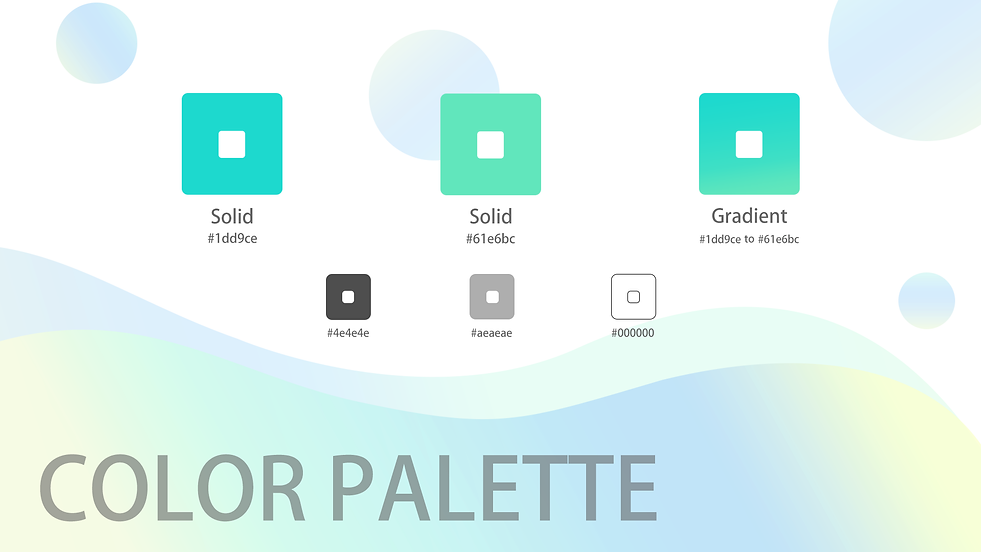
Color Palette
Visual Design


Font
Visual Design

When I worked on visual design for BONBON, I faced to 3 challenges.
Firstly, due to the time limitation, I had to finish logo design and UI design in 45 days to meet the deadline from wireframes to the final high-fidelity delivery. And in this 45 days, I experienced several times votes and modifications for the logo , 3 rounds iterations for wireframes and twice color tests.
Secondly, make the interactive elements reusable and expandable. This is the first time I meet this kind of challenge, so I must negotiate all the design details with the frond-end developers and product designer. To ensure the element reusable and expandable, meanwhile, keep user-friendly and consistent with the visual branding.
Thirdly, provide clear guidance to the development team and translate the visual design to the development language during implementation phases. Also create the art guideline for other designers to handover.

I used the demi-bold Langtinghei SC as the title font, including the page title, category title and game title to show the important information on the UI. And using regular Microsoft YaHei as the paragraph font, because this font is moderate bold, readable and visually comfortable. For numbers, I choose bold DIN Alternate to show them, not only to show difference between numbers and words, but the number is mainly show the storage capacity, it is a kind of important information. So the font is easy to stand out and distinguishable.
Originally, Tencent's logo is a penguin and most of products under Tencent use it to redesign logos for their own. As Tencent Bonbon is a game centre platform, when I started to design the logo, I preferred to combining the game element with a penguin to show the product positioning. And considering the circle shape can suggest community, friendship, love, relationships and unity, so finally we choose a direction that is a round penguins wearing the joystick goggles. During serval design iterations, we eventually got the logo as shown above. And also I put some other eliminated ideas of logo design below.
At the heart of color design, I choose green as the main UI color, adding the different value of green to make gradient that can create a flowing and vivid atmosphere. And select grey as the text color to show the information clearly.